RideTogether: Enhancing Urban Mobility An initiative blending technology and community to reshape urban cycling culture. We defined the initial problem space through secondary research (literature review, anecdotes, forums) and collated information via an Affinity Diagram to then define the overall objectives of RideTogether
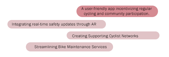
Potential Problem Spaces:
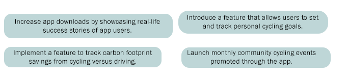
Aims:
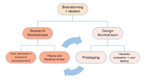
Defining Problem Space
RideTogether: Enhancing Urban Mobility An initiative blending technology and community to reshape urban cycling culture. We defined the initial problem space through secondary research (literature review, anecdotes, forums) and collated information via an Affinity Diagram to then define the overall objectives of RideTogether
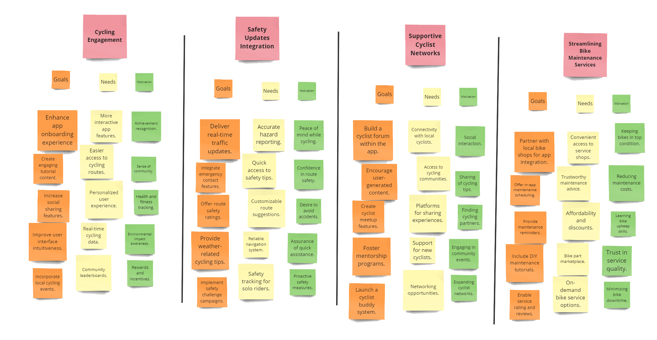
User Research — Affinity Map
The project team was partitioned into two synergistic work-streams. My involvement was within the Design contingent, responsible for the architectural conceptualization of the application, which encompassed the creation of system designs, the development of wireframe prototypes, and the execution of user experience testing. Concurrently, the Research division was engaged in rigorous investigative endeavors to yield a suite of design deliverables and to contribute substantive guidance for the design process.
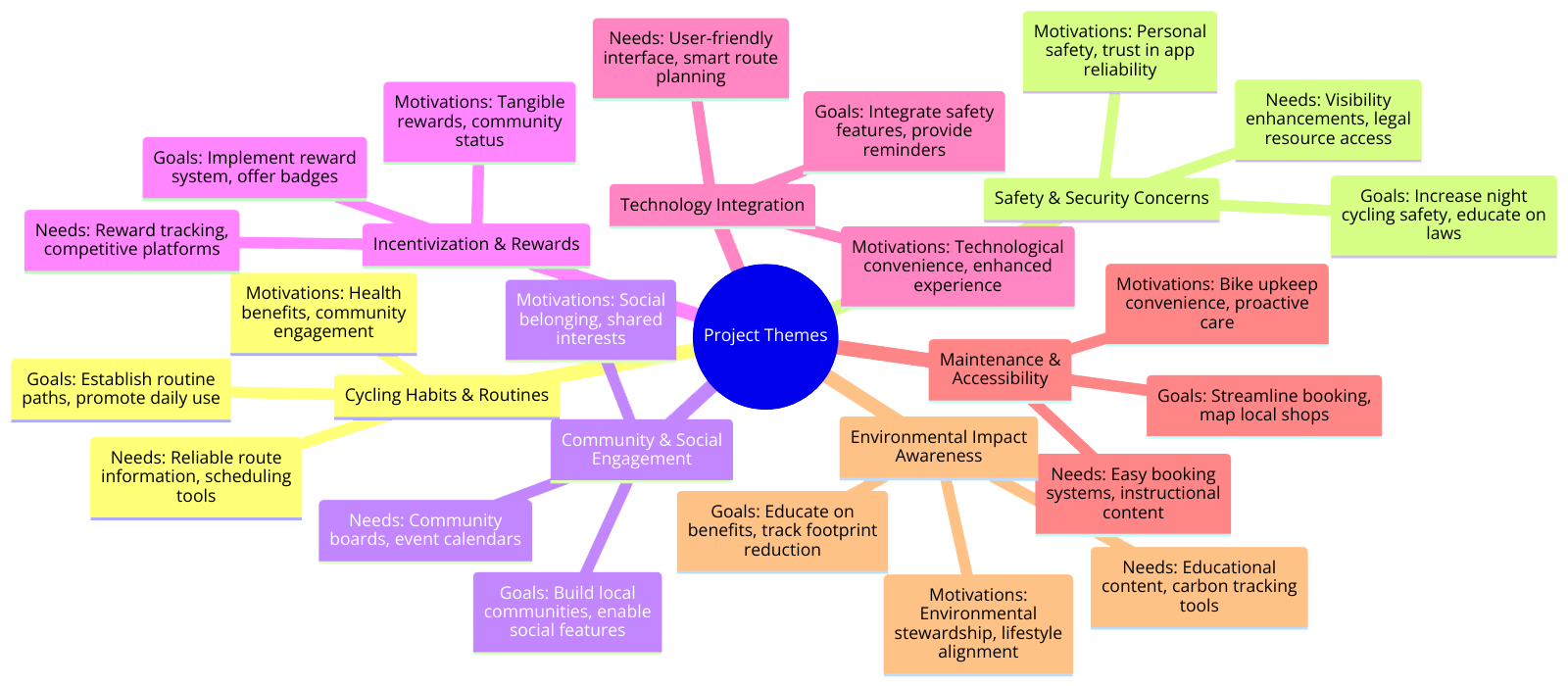
User Research — Theme Discovery
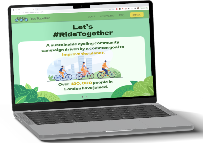
Mobile App
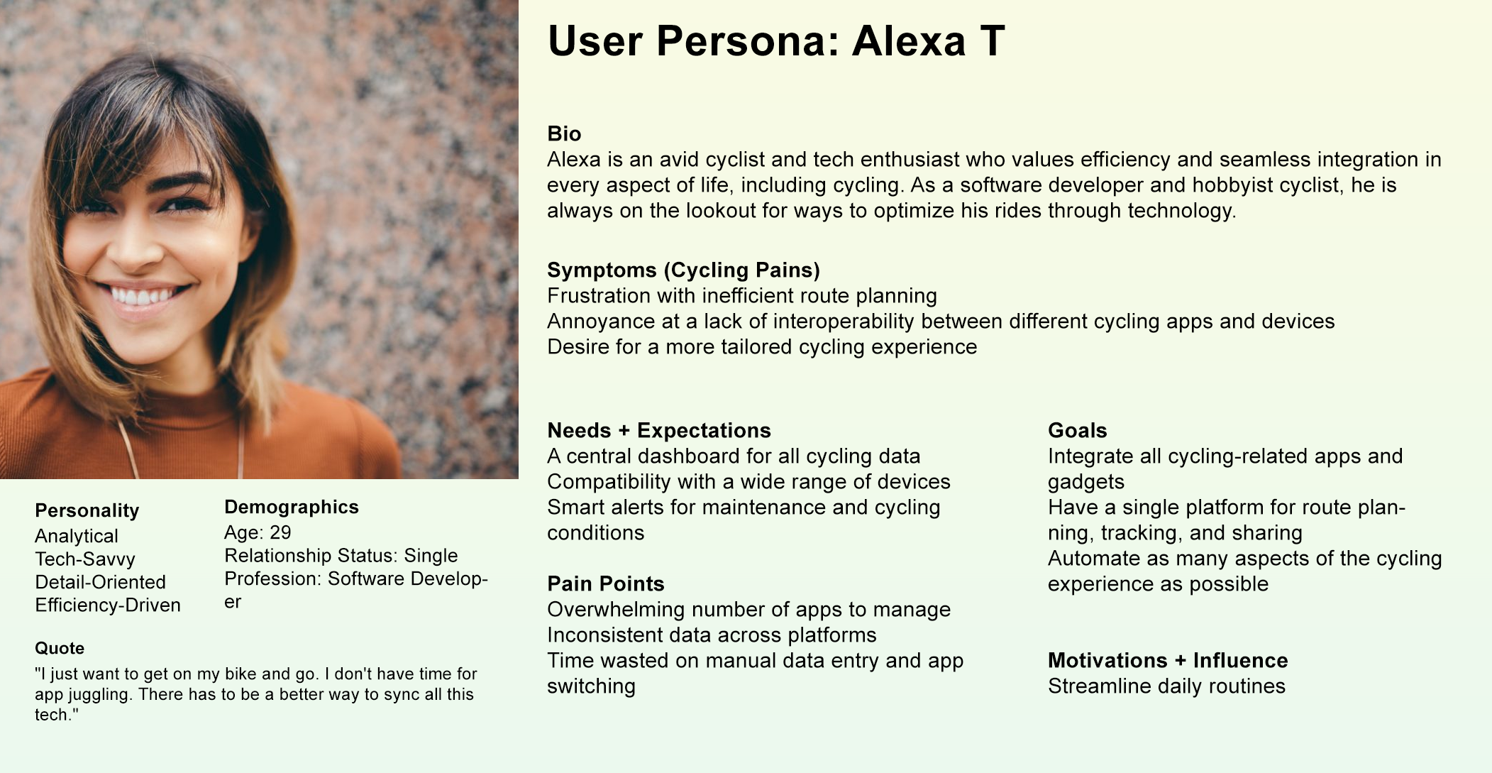
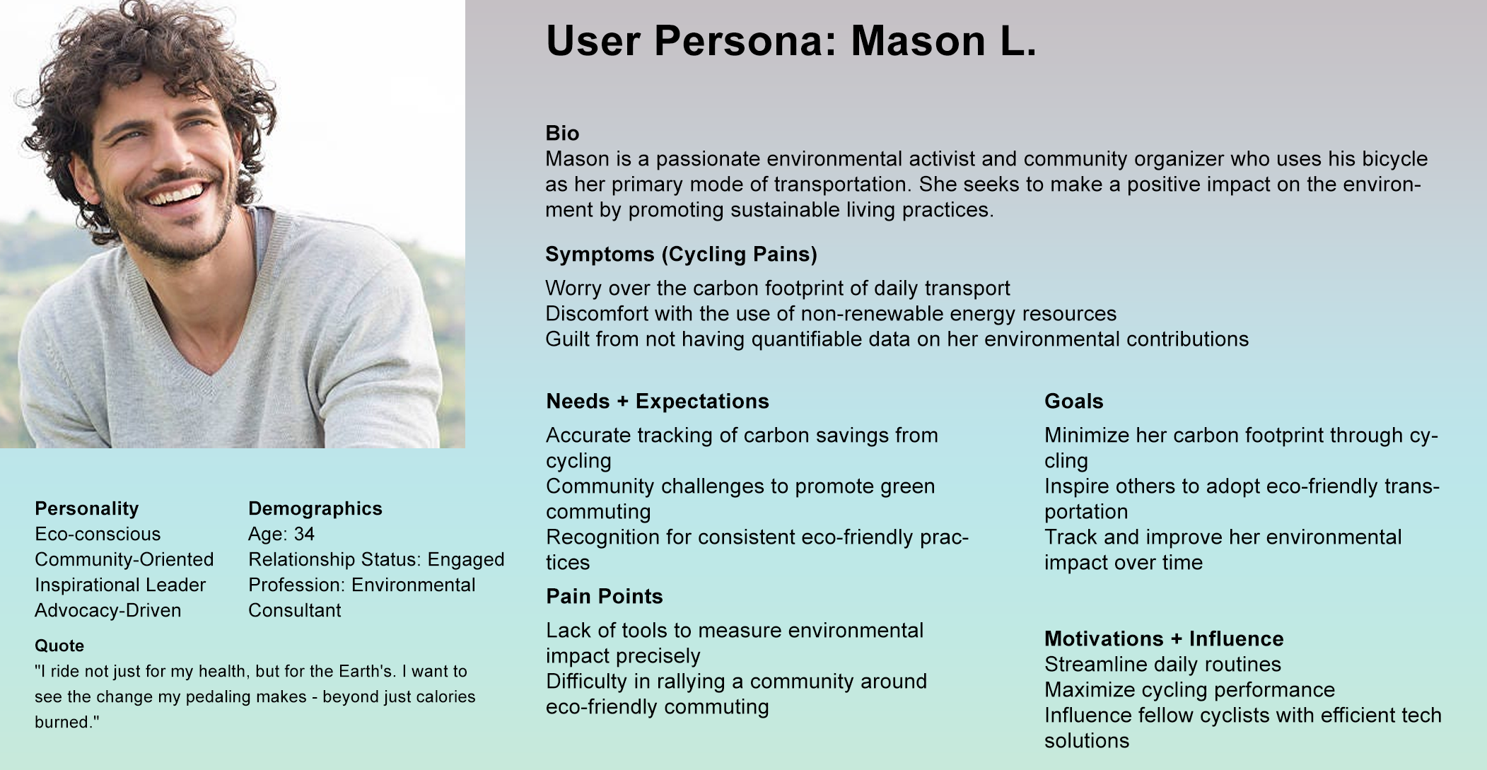
User Research — Personas & Scenarios
The Research Team conducted further secondary research on the goals, motivations, and needs for the potential project. Codes and themes were emerged from research findings via Affinity Mapping.
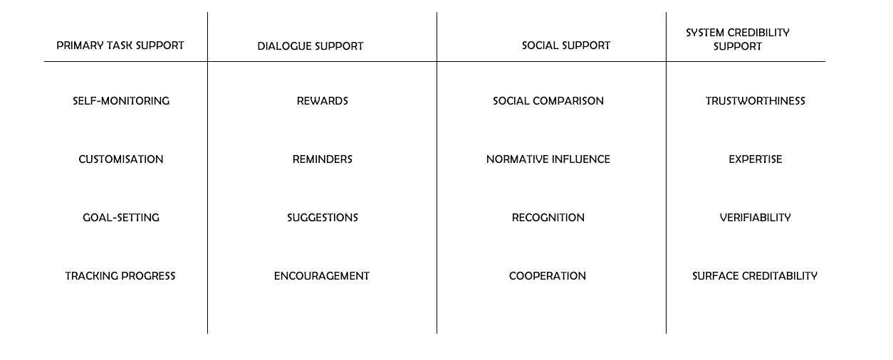
The Persuasive System Design (PSD) Model is a framework developed to guide the design and evaluation of persuasive systems. These are interactive computing systems created for changing users' attitudes or behaviors without using coercion or deception. The model shows how to systematically approach the design of a system that aims to persuade users effectively.
In investigating the barriers to cycling adoption, we deployed a questionnaire informed by literature, gathering 18 responses indicative of the key challenges: inadequate bike lanes, unsafe routes, and problematic motorist behavior. Further exploration through semi-structured interviews with four participants, followed by rigorous data coding and affinity mapping in Figma, revealed two primary obstacles: safety concerns and a deficient cycling culture. These insights directly informed our user requirements, shaping design features to enhance safety without distracting cyclists and to cultivate a positive cycling culture through non-confrontational, community-oriented campaign strategies.
Safety-Enhancing Features: Integrate technology that enhances cyclist safety without requiring significant attention, allowing cyclists to focus on the road.
Ease of Use: Ensure that the system and device interactions are straightforward and memorable, even when in motion.
Long-Term Engagement: Design devices and features with longevity in mind to support sustained use over time.
Community Engagement: Develop campaign elements that captivate and engage passersby, promoting community participation in cycling activities.
Motivational Incentives: Create incentives within the app to encourage and motivate both cyclists and non-cyclists to take action and participate.
Non-Confrontational Messaging: Craft campaigns and messages that avoid antagonizing motorists, aiming for a harmonious shared road space.
Scalability: Design the campaign to be scalable, ensuring it can expand and adapt to different community sizes and structures.
Prototyping & Storyboards
Over here, we delve into the visual planning of RideTogether's UX. This includes storyboards that narrate user interactions, wireframes outlining the app's structure, and mockups that bring the community board and hologram device to life, laying the foundation for intuitive design and user engagement.
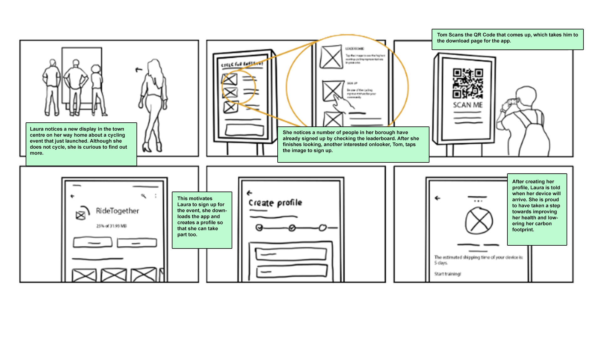
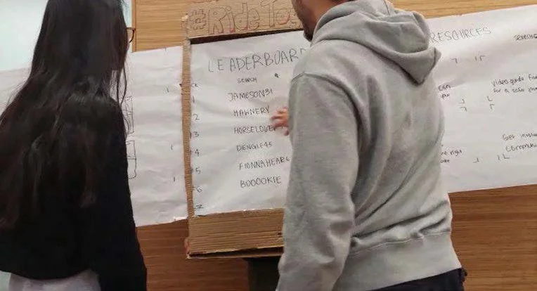
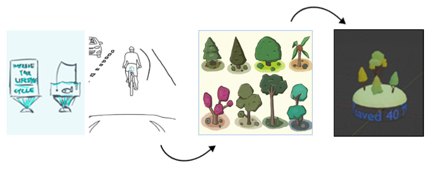
We began by crafting low-fidelity wireframes for an interactive community board, guided by initial storyboards and research. We tested our design with a life-size mockup and a Wizard-of-Oz experiment, observing user interactions to refine the interface for ease of use and encourage app downloads.Storyboarding some of the main interactions that could occur between the user and the app, the user and the interactive community board, and passersby and the hologram was an important part of understanding how our product innovated.
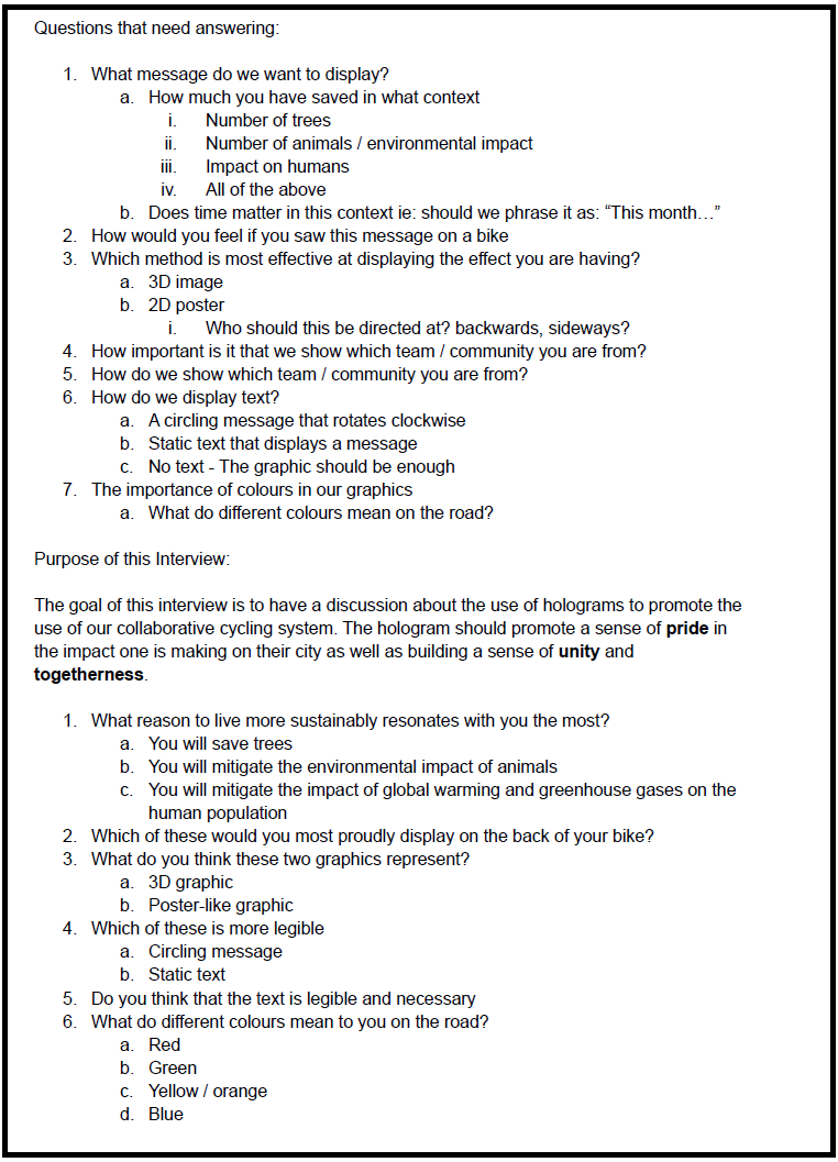
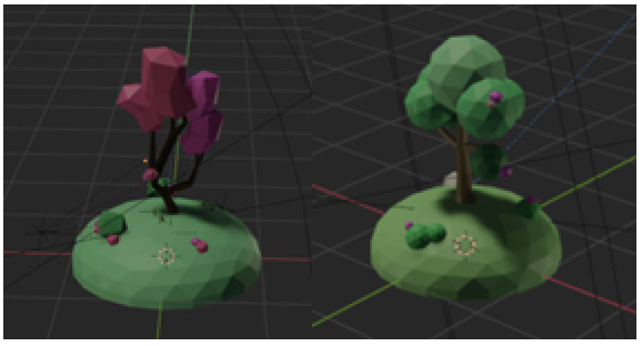
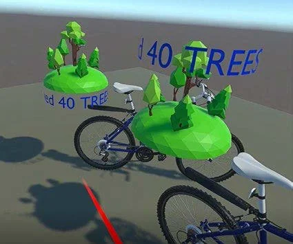
Progressing with the hologram device design, we moved from initial sketches to two main concepts: a traditional 2D design and an immersive 3D version. These concepts were brought to life using Blender, with the aim of balancing informativeness and visual appeal. We sought user feedback through interviews, focusing on message clarity, legibility, and the importance of competition. Participants' preferences, especially for distinct borough representations, were instrumental in the design refinement.
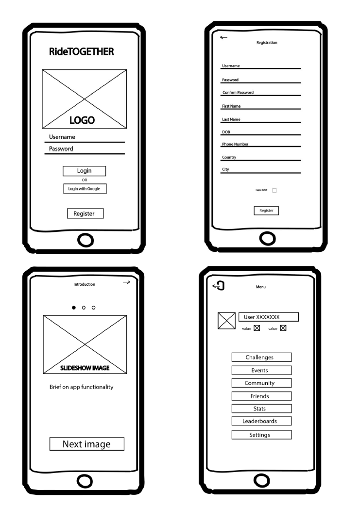
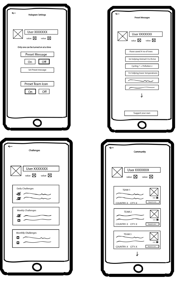
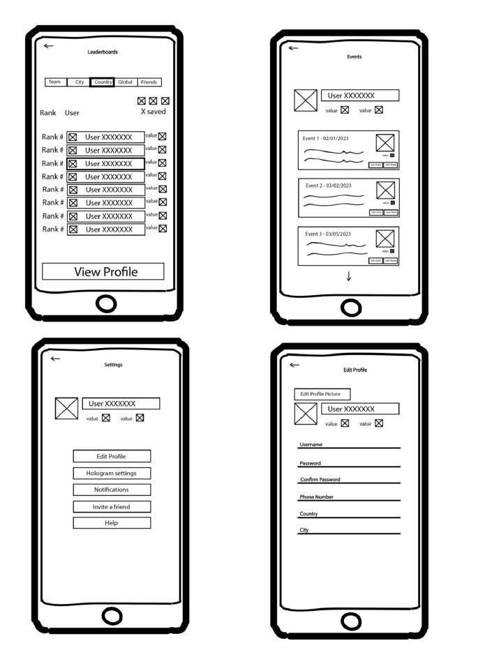
Lo-Fi Wireframes
The objective of creating Lo-Fi wireframes is to establish the basic layout and functionality of the RideTogether app without focusing too much on visual details. This phase emphasizes structure and user flow, ensuring all necessary components are included and correctly positioned.
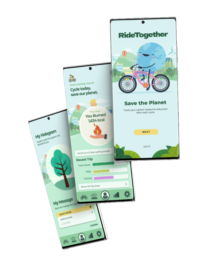
Hi-Fi Wireframes
In the Hi-Fi wireframe stage, we translated our validated concepts into detailed visual designs. The focus was on incorporating brand identity, intuitive navigation, and engaging elements. User feedback guided iterative refinements, ensuring the app was both visually appealing and highly functional, promoting regular cycling and community engagement through a seamless digital experience.
To explore the detailed designs and prototypes of the RideTogether project, you can access the Figma files and interactive prototypes using the links below:
RideTogether Mobile App:
Figma Design Link: https://www.figma.com/design/kccxqb2MRNZaonH6fbqPa0/Ridetogether-Apps?node-id=0-1&t=oADblgvJXUO6mDgU-1
Figma Prototype Link: https://www.figma.com/proto/kccxqb2MRNZaonH6fbqPa0/Ridetogether-Apps?node-id=0-1&t=oADblgvJXUO6mDgU-1
RideTogether Community Board Wireframes:
Figma Design Link: https://www.figma.com/design/kccxqb2MRNZaonH6fbqPa0/Ridetogether-Apps?node-id=72-14&t=oADblgvJXUO6mDgU-1
RideTogether Website:
Figma Design Link: https://www.figma.com/design/kccxqb2MRNZaonH6fbqPa0/Ridetogether-Apps?node-id=96-2372&t=oADblgvJXUO6mDgU-1
Figma Prototype Link: https://www.figma.com/proto/kccxqb2MRNZaonH6fbqPa0/Ridetogether-Apps?node-id=96-2372&t=oADblgvJXUO6mDgU-1
2 Personas that represent the target user group of RideTogether were developed on the finalised themes and codes.
User Requirements
Ride Together
Project Overview:
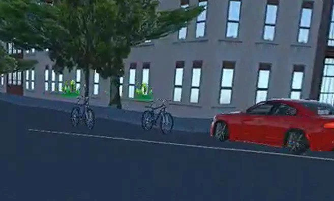
The RideTogether campaign was a UCL group project that aimed at increasing cycling engagement across various boroughs in London. It utilises hologram projection devices, interactive leaderboards, and a mobile app to foster a competitive yet united community spirit.
Duration:
8 Weeks
My Role:
UX/PRODUCT Design
User Testing
Product Evaluation
Summary:
Creating an engaging app to incentivize cycling, fostering community spirit, and promoting environmental sustainability through technology.
User Testing
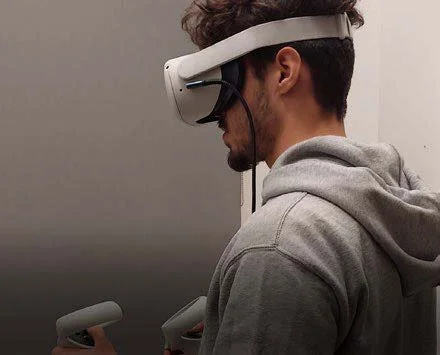
Our usability testing phase was integral in refining RideTogether's app and hologram interface. Engaging with five participants, we employed high-fidelity mockups and VR simulations to validate the functionality and user experience. This iterative process, including hands-on tasks and in-depth interviews, confirmed our design's intuitiveness and appeal, propelling us towards a user-centered final product. The testing outcomes, illustrated in the pictures below, were pivotal in finalizing the engaging features of our campaign element
Outcomes and Takeaways
Although this project was hypothetical, it provided valuable insights into the design process and user-centered methodologies. The Lo-Fi and Hi-Fi wireframe stages highlighted the importance of iterative testing and user feedback in refining design solutions.
Key Outcomes:
Enhanced User Clarity: Removal of confusing elements improved overall user satisfaction.
Engaging Visuals: High-fidelity designs aligned with brand identity and promoted user engagement.
Community Impact: Conceptualization showed potential for significant community building through cycling.
Takeaways:
Iterative Design: Continuous testing and feedback loops are crucial for effective UX design.
User-Centered Focus: Direct user input is essential in identifying and addressing pain points.
Scalable Solutions: Designing with scalability in mind ensures future adaptability and growth.
This project underscored the value of detailed planning and user engagement in creating impactful UX solutions.