
King's AI Portal
AI Portal (Web App) - Senior UX Design Officer, King's College London
Overview and role
King's AI Portal gives students and staff one secure place to use several AI models, including Kai, King's own assistant, which knows the university's services and policies. The risk with a portal like this is that it asks people to make a technical decision before they've typed a word: which model, and why that one? One interface has to serve:
Students, undergraduate and postgraduate, using AI for study, careers and King's services.
Researchers, staff and affiliates who need the same tools, with clear guidance on data and responsible use.
I joined in the pre-release phase, as the portal went through its final reviews before launch, as Senior UX Design Officer in Digital Innovation for Student Success. The job was to make it look and feel ready: make model choice feel obvious, teach good habits without lecturing, and work as well by keyboard as by mouse.I joined in the pre-release phase, as the portal went through its final reviews before launch, working with the UX Design team and Digital Innovation for Student Success. My job was to make it look and feel ready: make model choice feel obvious, teach good habits without lecturing, and make long conversations work as well by keyboard as by mouse.
“Most people at King's already use AI. Far fewer feel confident using it responsibly.”
Ahead of launch, an independent production-readiness review asked for the AI's behaviour to be clearer to the people using it. That became my brief: say plainly what Kai can see that other models can't, help people choose a model by what it's good at, explain what happens to uploaded documents, teach responsible use, and recognise more audiences than students and staff. All within five constraints:
Kai is King's own assistant, but the portal's value is choice, so Kai can't crowd out the other models.
A curated model list, deliberately short and chosen by King's.
One interface for five audiences: undergraduates, postgraduates, researchers, staff and affiliates.
Long AI answers still have to be easy to move through with a keyboard or screen reader.
Data and privacy explained in plain words inside the product, not only in policy pages.
The team's research set the direction: 72% of King's researchers already use AI tools, yet 81% rate their ethical confidence as low to mid. Before redesigning anything, I audited the live sidebar and logged nine issues. Four of them, before and after:
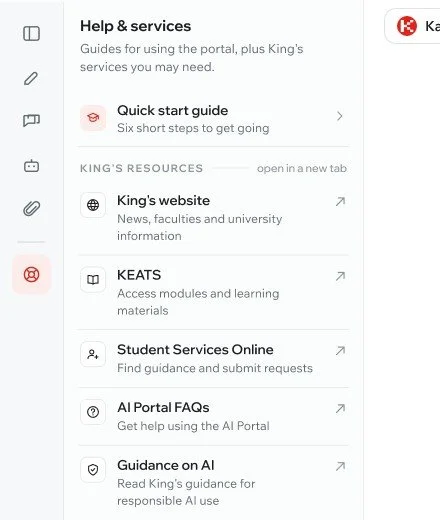
Before: a row of mystery icons
Most rail icons had no visible name, only a hover tooltip. The KCL website, KEATS and the FAQs all used the same red King's mark, and five links that leave the portal sat beside Chat History and Agent Builder with nothing to show they'd open another site.
After: a sidebar that explains itself
The rail keeps only portal sections. External links live in one Help & services panel, each with a name, a one-line description, its own icon and an “opens in a new tab” marker.
Before: every chat called “New Chat”
Projects and Chats hid behind two small toggles, every new conversation had the same title, row icons were inconsistent, and date groups were faint and fixed.
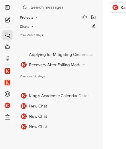
After: chats you can find again
Chat and Projects sit side by side, titles say what each chat is about, every row shows the model it used, and date groups can be scanned and collapsed.
5
Audiences, one interface
8
Quick start cards
6
Responsible-use habits
Which scenarios made the cut, and why
The UXD team prepared 14 persona scenarios across students, professional services, teaching staff and researchers. I reviewed each one: is it easy to understand, does the model switch earn its place, and where should it land: the website, the first-run screen or the prompt library? Each scenario starts with Kai for the King's-specific answer and switches model only if another one does part of the job better. Where Kai could do the job alone, the switch was removed.
That gave us the rule the model picker is built on: a switch has to earn its place, so the default has to be good enough on its own. The scenario review and the design decisions below are mine, made with the product team and stakeholders in Digital Innovation for Student Success.
Five decisions behind the chat workspace
Each one answers a question from the launch review or a finding from the research, and each was tested against the persona scenarios.
Key decision 01 · Choosing a model
Describe models by the job, not the name
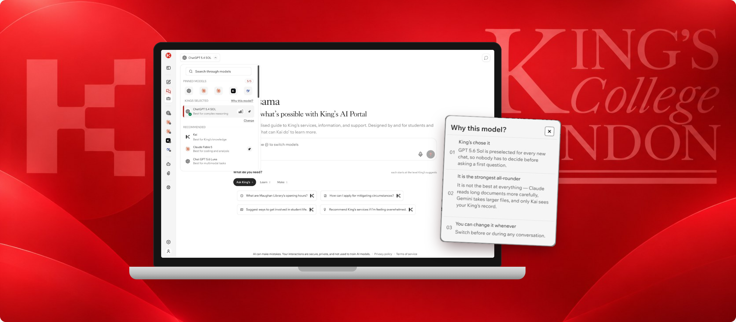
The picker opens on King's selected model with one line on what it's best at, followed by recommended models described the same way: careers navigation, coding and deep analysis, multimodal tasks.
Every row carries a strength meter and a pin. Up to five pinned models sit at the top and on the sidebar rail, and typing @ switches model without leaving the keyboard.
Key decision 02 · The default
Explain the default instead of hiding it
Everyone starts on the same King's selected model, so nobody has to decide anything before a first question. Why this model? says who chose it, what it's strongest at, where others do better (Claude for long documents, Gemini for larger files, Kai for anything that needs your King's record) and that you can change it at any time.
Key decision 03 · Curation
A short list, with a way to ask for more
The catalogue is curated on purpose. When the model someone wants isn't there, the picker doesn't leave them at a dead end: Request a model asks just two things, which model and what it's for, and says a sentence is enough.
Requests go to the team that maintains the catalogue, so real demand shapes what gets added.
Key decision 04 · Getting started
Prompts that start where people are
The first-run screen groups suggested prompts into Ask King's, Learn and Make, and each one starts on the model King's suggests for it, so a first-time user has something useful to try straight away.
The prompts come from the persona scenarios, hero examples first, and a Kai mark shows which ones answer from King's own information.
Key decision 05 · Projects
Keep related work in one place
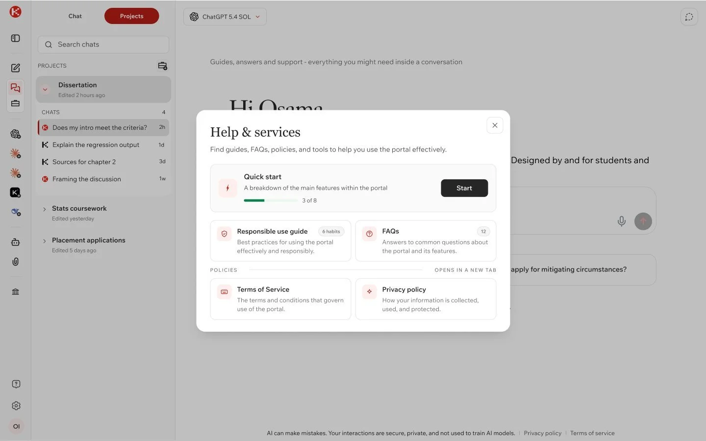
Coursework and research rarely fit in one chat. A project holds its own chats, the files made in it and the files attached to it, so a dissertation or a placement application lives in one place.
Files are split into Made here and Attached, so it's clear what the AI produced and what you uploaded.
One sidebar, five audiences
King's links are only useful if they're the right ones. The resources panel changes with who's signed in, so each group sees the handful of King's services they actually use, one click from the chat.
Undergraduates: KEATS, student records, timetable. Postgraduates: adds Library Search. Researchers: SharePoint, PURE, Research Support Hub. Staff: intranet, Helix IT, HR. Affiliates: just the King's website.
Designing for people who can't see the screen
For a screen-reader user, a chat is one long column. Every answer pushes the message box further away, a streamed reply can be read out half-finished, and there's no quick way back to an earlier question.
We designed a content bypass: shortcuts to the first message, the latest response, the message box, the prompt index and the conversation list. I explored two patterns, a skip-link bar on the first Tab press and a jump-to menu that reads out each landmark before you move, with focus shown in King's red.
Teaching the portal from inside it
Responsible use and onboarding were written as product content, one idea per screen: eight quick start cards that track progress, six habits written as Do and Don't, and 22 FAQs that each open with a single plain sentence.
What's next
Test the model descriptions with students and staff, track how often people switch model and whether the default holds up, and build the jump-to menu into the live product with screen-reader testing.